Exhibition Poster 1988
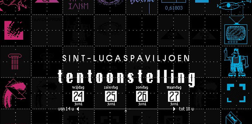
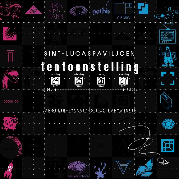
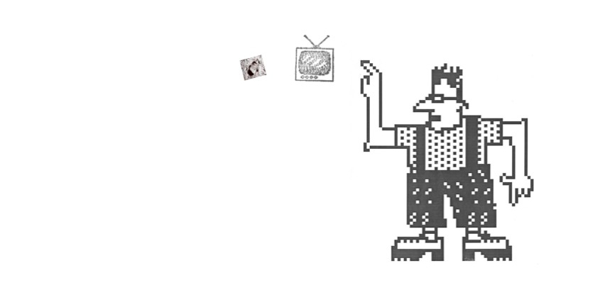
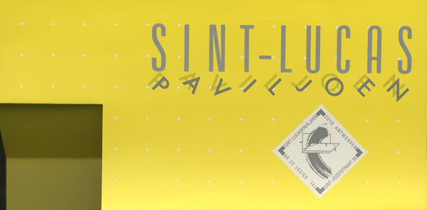
1988: A poster for the yearly graduates exhibition. Emphasis on the new tool: the computer. Done in serigraphy. Here a translation of the accompanying text (backside of invitation): This exhibition lasts 4 days. During these 4 days it’s open for 4 hours. There are 4 departments in the Art College. The school’s brochure is based on the square. 4 reasons for the format choice with 4 equal sides.This exhibition lasts 4 days. During these 4 days it’s open for 4 hours. There are 4 departments in the Art College. The school’s brochure is based on the square. 4 reasons for the format choice with 4 equal sides: the square! 4 reasons for 4 colours. Consider the fact that students, teachers, direction, visitors... are influenced by social, economical, political, scientific and cultural past and present. It is the “frame” for all the presented works. A frame (kader) is also called a “lijst” (list) in Flemish. This poster got a frame with a list (inexhaustible) of conscious and unconscious influences and within this frame the exhibition happens. Ideas do not fall from the sky! It is my standpoint as a designer that i have to try to catch the attention and keep it since the public due to the image culture is only looking superficially. How to do this? By declaring that I hide stuff! It is simple: I count on a basic human talent: curiosity! I can assure you that the number 4 looks pale compared to the number of ideas hidden in this poster! It should be 4 to the power of 4! (Sometimes I like to exaggerate) To tell them all would lead me too far but I will give you 4(four) clues as an app(l)etizer. For instance the design consequences of the number 4: everybody will notice the division in 4 to the power 3 squares: 64. Each of them measures 64mm. The subdivision in 256 squares (4 to the power of 4) will also be obvious. The fact that 4 single eyes needs some searching. To find an extra 4 pair of eyes already requires some typographical history knowledge. Find the 4th floppy disk! The little man on H6 needs 4 knight moves to teach you some chess (is this coincidence?) but by doing so he points to 4 important things! Something else: the four corners, the diagonal schism and the balance. Down left is a familiar looking rocket, Up right is a configuration out of space. Top left is a scene from Lascaux with in opposition: a computer mouse! The beginning drawn in stone, the present carved on the screen with a mouse. All this in what we call the computer era. Just above the rocket: the moon. And of course the little man on the moon does not exist, the moon is only a rock: ein stein. It tells you that black and white is very relative! That becomes clear when you pass the poster: the dark and light squares change 4(!) times while you walk by! (due to the varnish ink and the matte black). The text to the right of the rocket is only for the die-hards.... a square with a lot of little drawings....many meanings.... I wish you a happy experience watching this!!!!

